The Best Fonts for Signs and Banners
A font is the design for how text appears and the characters are formed. Some sign fonts are tall and thin, others are short and heavy, while others are simple or ornate. Choosing the best fonts for your sign is essential to the sign’s success. Where to start?
There are hundreds of thousands of different fonts — each with its own personality and purpose. While choosing among them might seem to be a simple matter of personal preference, different fonts are better suited to different purposes. Choosing the best fonts for banners or signs that are viewed from a distance is very different from choosing the right typeface for a wedding invitation or a news magazine. Then, too, some fonts that are effective on a computer screen do not translate to print well, and vice-versa.
Not to worry, at Printmoz, our expert graphic designers have compiled the following advice to help you choose the best fonts for signs, posters, and banners.
The "Best" Sign Font? It's All About Readability
There are several factors to consider when choosing a sign font, including your corporate branding and the sign’s purpose. But finding the “best” font for banner design begins and ends with readability. If your intended audience cannot quickly and easily read and comprehend your message, it won’t matter how cool or on-brand the design is; the sign will have failed its purpose. So the most critical factor in choosing the best fonts for signage must be readable under the conditions where you will display the sign.
The size of the sign and the distance from which it will be viewed present a challenge to reading your message. Will it be posted for pedestrian traffic to read, or will it be seen from moving cars? Will your sign include just a single word or short phrase? Or will it convey more information? These are key considerations for choosing easy-to-read fonts for your sign.
Plan the size of your sign and the amount of text it will include carefully to ensure readability. No matter what sign font you choose, it’s essential to have sufficient blank space around the text so it can be easily read.
Did you know that every inch of letter height gives you an additional 10 feet of viewing distance? So, text that is five inches tall can be read by most people at a distance of 50 feet. Use this rule of thumb as you design your sign and choose the banner fonts.
Size is important, but it isn’t everything when it comes to the readability of your sign font. Fonts have individual features that also affect readability.
Sign Font Features
Various banner fonts have many different styles. Some are scripts, and others are block types. But there are fundamental features common to all fonts. Understanding them will help you to choose the best font for your sign.
Two primary types of fonts for signs are serif and sans serif. A serif is the small, slight projection added to the letter's beginning, end, top, or bottom in many non-script fonts. Serifs add flourishes to individual letters that make dense blocks of text easier to read. Although the letters are not connected as they are in a script style, the serifs visually move the eye to the next letter in the word. Serif fonts have these added flourishes, and sans serif fonts do not.
Serif fonts were first introduced in the 1780s and today, they have a somewhat old-fashioned appeal. While still used widely for books and newspapers, serif fonts did not translate well to digital screens, where sans serif fonts are more widely used.
The best display fonts for signs include both serif and sans serif fonts.
A font’s weight is another important feature to consider when choosing sign fonts. The weight refers to the thickness of the letters — their visual weight. Bolded text has a greater weight. The best fonts for signs and posters have a good weight, making them easier to read at a distance.
If your sign text will be very short, for instance, EXIT or We’re Open, there is no need to use more than one sign font. But if you plan to include several lines of text, using more than one font can make your sign easier to read and more visually appealing. But mixing fonts for signs can be tricky to do well. Printmoz is here to help!
An essential key to making your sign readable is contrast. Use high contrast between the text and the background color to make the text pop. And use contrast when mixing fonts. For instance, a highly decorative serif font contrasts well with a minimalist sans serif font. A heavy-weight display font contrasts nicely with a regular or even a lightweight text font. Contrasting both serif and weight qualities is vital for successfully mixing sign fonts.
Typically, when using multiple fonts for signs, it is best to create a hierarchy for your text. For instance, use a display font for the headline and a contrasting font for the sub-title. Also, be sure any font used for text of five words or more is an easy-to-read font.
To get the most out of mixing your fonts, stop at three. Any more than three fonts becomes too busy looking.
7 Best Fonts for Sign Readability
There are thousands of excellent display fonts that make a decorative splash on signs and banners. But for fonts that are easy to read even when they are several inches high and emblazoned on a sign to be read at a distance, the following are our top sign font recommendations:
1. Futura
Futura is a geometric sans serif font with a clean and contemporary appeal ideal for business signs and custom banners.2. Helvetica
Helvetica is one of the most popular fonts worldwide. It has been referred to as “the little black dress” of typography. It’s one of the best fonts for sign headlines or text.
3. Optima
Optima is a graceful semi-sans serif font that uses flaring and varying weight to accomplish what serifs do. It’s an ideal choice for all types of signs.4. Bodoni
Bodoni is the first serif font to make our list of the best fonts for signs. It's an easy-to-read font for banners and signs with great contrast between heavy and light lines paired with serifs.
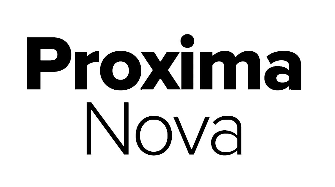
5. Proxima Nova
Proxima Nova is a well-balanced sans serif font that combines modern proportions with a geometric appearance.
6. Myriad
Myriad is highly readable and one of the best sans serif display fonts that also works well for blocks of text. It is part of Apple’s corporate branding, and has a contemporary feel.
7. Garamond
Garamond is a highly popular and readable serif font for signage. It is ideal for body text and makes excellent use of negative space.
When it comes to readability, remember that the classics are classic for good reason. And please remember that fonts like Comic Sans and Papyrus make graphic designers weep for all the wrong reasons!
Count on Printmoz for Your Design Needs
When you’re ready to design your corporate signage or custom banners, the Printmoz free online design tool makes it easy to upload your photos, work with templates, and select the sign fonts of your choice. Still stuck on how to make your sign pop? Our expert graphic designers will be happy to help you make your sign effective and memorable. 


Leave A Reply